
The way your visitor feels about your website determines whether he/she will use it again.
If things are hard to find and users have trouble navigating and understanding what your site is about— forget conversions; in fact your visitor will make it a point not to return.
Hence it’s necessary that you pay attention to the UX on your website and strive to improve it.
Don’t make them choose between lots of things
In order words keep the design simple and content to the point to minimize unnecessary clicks. The same goes for advertisements. Research by Janrain and Harris reveals that over 72% of users get annoyed when seeing irrelevant ads and promotions on a site. They begin to question the purpose of visiting the site.
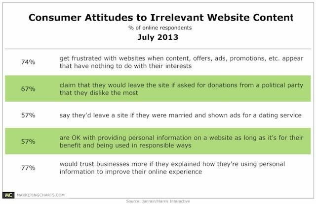
Research done by Missouri University reveals that people on visiting websites take less than 2/10ths of a second to form a decision.
It’s essential to keep a minimalist design because the eye tends to spend time on each element.
Users devote time to each element on a website as follows:
The institution’s logo: Logo is definitely important element as subjects spend 6.48 seconds focused on this area on an average before moving on.
The main navigation menu: Subjects spent an average of 6.44 seconds viewing the menu items.
The search box: Subjects spent over 6 seconds watching the search box.
Social networking links to sites such as Facebook and Twitter: Users spent about 5.95 seconds viewing these areas ( Research reveals that Facebook, Twitter and Google social media buttons load after a total of 19 requests and takes 246.7k in bandwidth.”)
The site’s main image: where users’ eyes fixated for an average of 5.94 seconds.
The site’s written content: where users spent about 5.59 seconds.
The bottom of a website: where users spent about 5.25 seconds.
The participants also said that their impressions of a website were influenced by the main color and background color of the website. Good color contrast between the text and background so that the text becomes easier to read was another point.
How to find out where users are facing trouble?
One of the best ways to find out hiccups is by seeing visitors in action, trying to go around your website— i.e. a usability testing.
This posts lists out different usability testing tools for both mobile apps and websites.
You can hire testers who’d see the ease with which your website interface can be used. This’d also reveal flaws in how you have designed basic tasks. If first time users take a lot of time to perform basic tasks it may imply that the tasks be made simpler.
Other than that, Google Analytics, can come to your help. If you see a high bounce rate on specific pages, it may be mean that users aren’t finding what they are looking for and leaving.
Click tracking and heatmap softwares like ClickTale, CrazyEgg reveal the entire story on how your users see and interact with the site.
Shown below is Attensee’s original landing page. The red areas are the ones where most users’ eyes were focused at. You can easily understand that visitors after seeing the headline quickly moved down to the benefits.
The vast areas covered by green shows that visitors weren’t engaged at all. The landing page wasn’t doing enough in sustaining the interest of the readers.
To get higher engagement, Attensee’s Unique Value Proposition on the upper right corner was given a yellow background.
This subtle change made the visitors realize what the page was about with even more ease and led to a 12% increase in conversions. A mere yellow background.
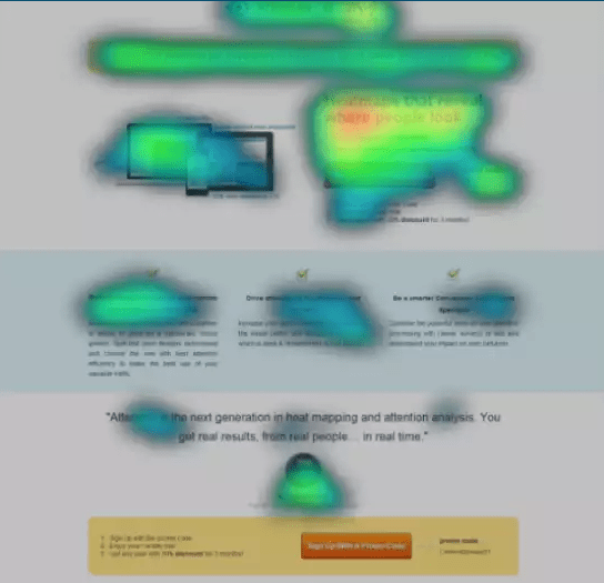
Heatmaps can tell you if the landing page or any page interests the readers. Taking cue from the onpage behavior you can alter the page to highlight the main benefits of using your service and get even more conversions.
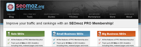
Have a look at Hulu’s landing page and how the green CTA stands out with its distinct color among all other images that seem to blend into the background.

This is an important thing to note considering that there are sites where finding out the sign up button is a ritual.
How to present a strong value proposition so that your user learns to differentiate you amongst others even in a crowded niche
Value proposition can make or break your site and is the barrier between continuing browsing a site or hitting the back button.
Value proposition isn’t merely a tagline but it is what that communicates what your site does. If your brand is insanely popular like Microsoft you can do without one, but if it isn’t, keep reading.
It communicates the benefits to the end reader in a short single line. An image accompanying the message can facilitate this communication. A vague message like “Making a better world” doesn’t tell your readers that you develop software apps. Be clear and concise
How to relate with your customer?
Value proposition doesn’t end with the headline. The navigation menu items and the language used on the site all convey your USP(Unique Selling Proposition).
When SEOMoz rebranded to Moz here’s what they did with the headline.
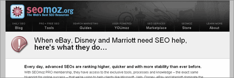
The headline is relying upon a form of customer testimony to make its statement.
By communicating in the language that he/she is familiar with you can relate to the customer. So instead of menu item that says “consumer information” use menu items that say something like “Software demo”.
Card sorting is a good method to find out how users understand your website. This is how you can go about it.
- Prepare a stack of cards with each card containing the title or function that a page of your site performs.
- Give these cards to 15 participants and ask them to separate the stack into groups
- Now assign blank cards to each user and ask them to write a description of what makes that particular group a group.
- From this you can find out how people classify different cards, the words they use for the groups, the cards appearing in different groups etc.
All of which enables you to have an insight into your user and craft a better value proposition.
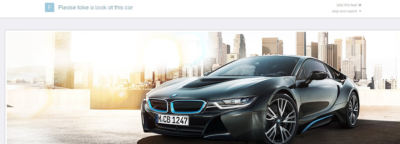
The five second test is another method to test if your site’s messaging is clear to your readers. You can just go to the site, register and then show your urls to a random set of people.
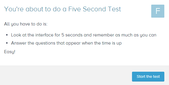
From their observations you’d be able to understand if the messaging is good or needs some work.
Please see the images to understand the process clearly.
Showcase positive social proof, user testimonials
When it comes to making buying decisions, people love testimonials and social proof.
Over 63% of consumers say that they will purchase from a site if it has product reviews and ratings. Source
Social proof about the service along with the images of the people who are using it improves conversions because people love human faces and trust them.
It’s as if the fame of the person giving the testimonial pours over to the site.
See how Kissmetrics leverages social proof on their pricing page.
Concluding thoughts!
Improving the UX on your site by listening to and understanding what your customers want is one of the better things you can do today to improve conversions.
It doesn’t take lot to do that. Just dive into your analytics and watch if there are any areas that cause friction.