Published by Terminus, the marketing taxonomy governance platform.
Complete Guide to Build a High Converting Landing Page
Last updated

You’ll spend a lot of time, energy, and money driving traffic to your website. Naturally, you want those visitors to become subscribers and buyers.
To convert traffic, you need a landing page.
A landing page is a page on your website designed to convince visitors to take a particular action. That action will vary depending on your business and your goals. You might want them to sign up to your email list, download a resource, enroll in a webinar, buy a product, etc.
“If these destinations don’t entice prospective customers into your sales funnel and educate and convert them into customers, you are wasting your time,” says digital marketing expert Neil Patel.
On the web, first impressions are important. Ion Interactive says people form their first impression in 1/20th of a second. If that impression isn’t positive, they’ll immediately abandon your website.
Well-designed landing pages are critical to the performance of your marketing campaigns.
So you need a well-designed landing page. It’s critical to the performance of your overall marketing campaign.
So What Makes a Great Landing Page?
Context - A strong landing page meets your visitor’s expectations. The content of the landing page matches the link they clicked on from another source. This is why 48% of marketers create a new landing page for each campaign, according to HubSpot. For instance, if they clicked an ad for a free eBook on saltwater fishing, the landing page should give a free eBook on saltwater fishing.
Trust - The visitor must accept your landing page as trustworthy. If they worry that your brand isn’t capable of delivering on the page’s promise, or that you won’t handle their information appropriately, they won’t convert.
Simplicity – Web experiences should always be as simple as possible. Landing pages are no exception. Your page should be simple to follow, easy to use, and absolutely clear on how to take the next step. Any unnecessary elements (including links to other pages) should be stripped away.
Step 1. Craft a Clear Headline
The headline is the first element your visitors will notice. At this point, they haven’t invested any time into understanding your page, so it’s easy to decide to abandon your site. Make your headline clear, compelling and enticing so they decide to read more.
The reader will be asking themselves “What’s in it for me?” Your headline should answer this question. Use benefits-based language. Specific headlines are best, but avoid using unnecessary words and meaningless adjectives.
- Bad headline: How to Start Your Own Business
- Good headline: How to Take Control of Your Life by Starting a Business
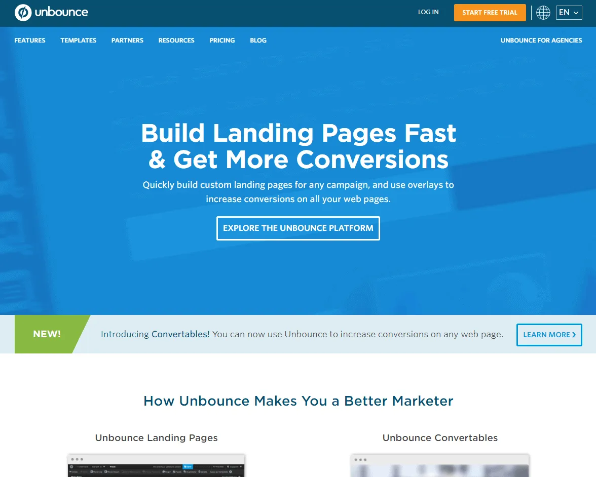
Notice this headline on Unbounce’s site. “Build Landing Pages Fast & Get More Conversions.” The visitor knows exactly what the page is about and why signing up would benefit them.
Step 2. Write Strong, Relevant Copy
Your visitors will read your page quickly, so don’t put too much text on the page. After your headline, include a subheading that restates the main benefit, then a short paragraph that explains the offer, then a few bullets with more benefits or features.
Wherever possible, use the same language on the page that you used on outside sources, like social media posts, email campaigns, or paid ads. This reinforces the relevance and context, which is especially important for Google AdWords.
You’ve probably seen long sales pages with 10,000+ words. Those pages are effective when there’s more risk or cost associated with the offer. According to Conversion Verve, when the conversion goal is low-risk for the visitor (like collecting email sign ups), shorter pages are better.
Step 3. Remove all Distractions
Your landing page should have a single purpose. Do not allow your visitors to take any paths that do not serve your page’s purpose. “The point is that the visitor cannot ignore your message by navigating away, and therefore focuses on only that page,” says Peep Laja of ConversionXL.
Do not link to any outside websites. Remove any navigation links to the rest of your website. You should even unlink your logo so visitors can’t travel to your home page.
Step 4. Reinforce Brand Awareness
Even though the landing page is part of a specific marketing campaign, it should still represent your brand. Use similar colors and design features whenever possible (assuming they do not affect conversions). This helps your traffic associate the page with your brand so they know it’s trustworthy.
Step 5. Use Strong Imagery
40% of people respond more strongly to visual elements than text (and our brains respond faster to images anyway), so it’s smart to have images, video, and custom-made graphics on your page.
Images should add to your design, not clutter. It’s smart to use the same images on your landing page that you used in your off-site promotions for consistency and a seamless experience.
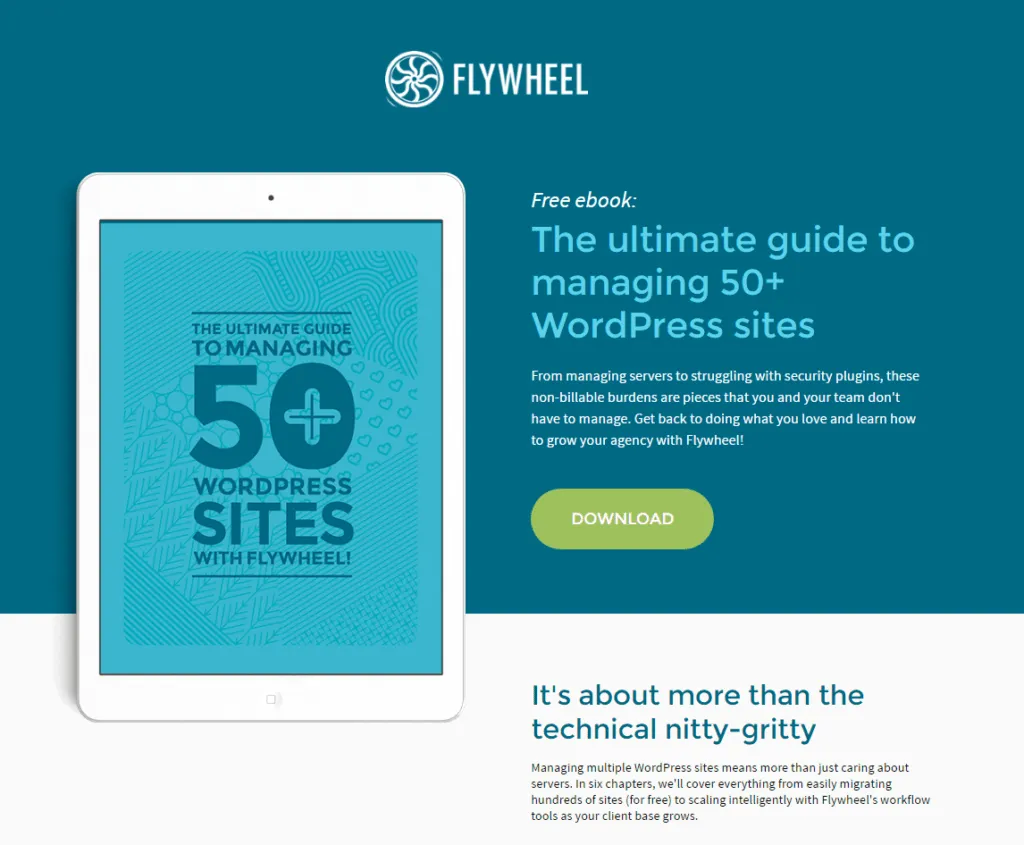
This landing page by Flywheel uses a striking image that compliments the page without distracting the visitor.
Page load time affects Google rankings, so go easy with visual elements if you expect traffic to find your website through Google.
Step 6. Include Social Proof
As humans, we are more comfortable taking action when we know other people have done it before us and had a positive experience. Social proof is evidence or testimony that other people have used your product or like your brand.
The most common types of social proof are…
- Testimonials from users/subscribers/buyers.
- Testimonials from influencers/celebrities.
- Reviews from users/subscribers/buyers (in the form of comments or ratings).
- Counters that display the number of times the page has been liked or shared on social media.
- Logos of businesses/brands/partners that have used or are using the product.
- The number of people who have subscribed or purchased.
Step 7. Create an optimized lead generation form
On most landing pages, the call to action is a lead generation form, used to collect visitor information. This is the component that facilitates the conversion, so you have to get it right. Your form should be…
Easy to locate and use. Place it high on the page before the visitor has to scroll. Make each field large enough to see and click. Use clear labels or placeholder text so visitors know what information you require.
Set apart from the rest of your page. Use a border, colored background, or some other design element to highlight your form.
Free of unnecessary fields. Only ask for the information you absolutely need. Every action you ask users to take reduces the number of people who will complete the process. Expedia increased their annual profit by $12 million by removing just one field from their form.
Include some imagery. According to Basecamp, adding images of people is particularly effective because it invokes an emotional response.
Like any landing page element, you should test your form’s performance with A/B testing.
Step 8. A Clear Call to Action
Every landing page requires a call to action. If you use a form, your call to action would be the “submit” button. If your page sells a product, your call to action would be the “buy now” button.
The call to action button should be eye catching and the copy should be clear. Use simple phrases like “BUY NOW,” “ENTER GIVEAWAY,” or “TRY FREE NOW.” Test multiple colors, designs, and placement to see which works best.
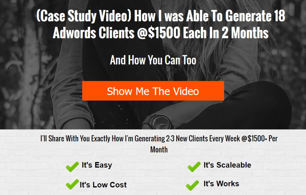
This landing page from More Clients More Results makes their call to action stand out with a unique color. It’s impossible to ignore.
Create Your Own Landing Page
If you aren’t a coder or don’t have your own website, that doesn’t mean you can’t use landing pages as part of your marketing campaigns. These tools have offer template options (which are often built with best practices in mind), but also allow you to create your own custom designs.
- Unbounce: Build and A/B test landing pages.
- PopUpDomination: This is a popup opt-in box, but the content of the box can be used to create a pseudo landing page.
- Leadpages: This is the most popular landing page tool. You can create pages even if you don’t have a website.
- Instapage: This is similar to Leadpages, but free for the first page.
- Getresponse: This is an excellent option if you already use Getresponse’ email marketing tool.
Final Thoughts
Landing pages are the most powerful way to capture leads and create sales. Nearly all marketing campaigns use them in some way. They must be optimized to convert visitors. If your landing pages aren’t crafted carefully with the above best practices, all the traffic you collect (through social media posts, press releases, ad campaigns, email marketing, etc.) will be wasted.
Always remember: Testing is the most important part of marketing. Regardless how well your landing page converts, it could always be better. Regularly test new ideas to give your campaign the best chance of success.
- 3 Users
- 5 Projects
- 2 Custom Domains
- Simple Taxonomy
- UTM Rules
- Presets
- Labels
- Notes
- Custom Parameters
- Multi-tag UTM Builder
- Auto-shortening
- Click Reports
- Fine-grained User Permissions
- Auditing Tools
- Chrome Extension
- Custom Domain SSL
- URL Monitoring
- Redirect Codes / Link Retargeting
- Bulk Operations
- 5 Users
- 10 Projects
- 3 Custom Domains
- All Taxonomy Types
- Bulk URL Cloning
- QR Codes
- Conventions
- Grid Mode URL Builder
- Email Builder
- Auto-generated Tracking IDs
- Automated Exports
- API Access
- Custom Users
- Custom Projects
- Custom Domains
- Single Sign-On (SSO)
- Invoice Billing
- Signed Agreement
- SOC 2 Type 2